

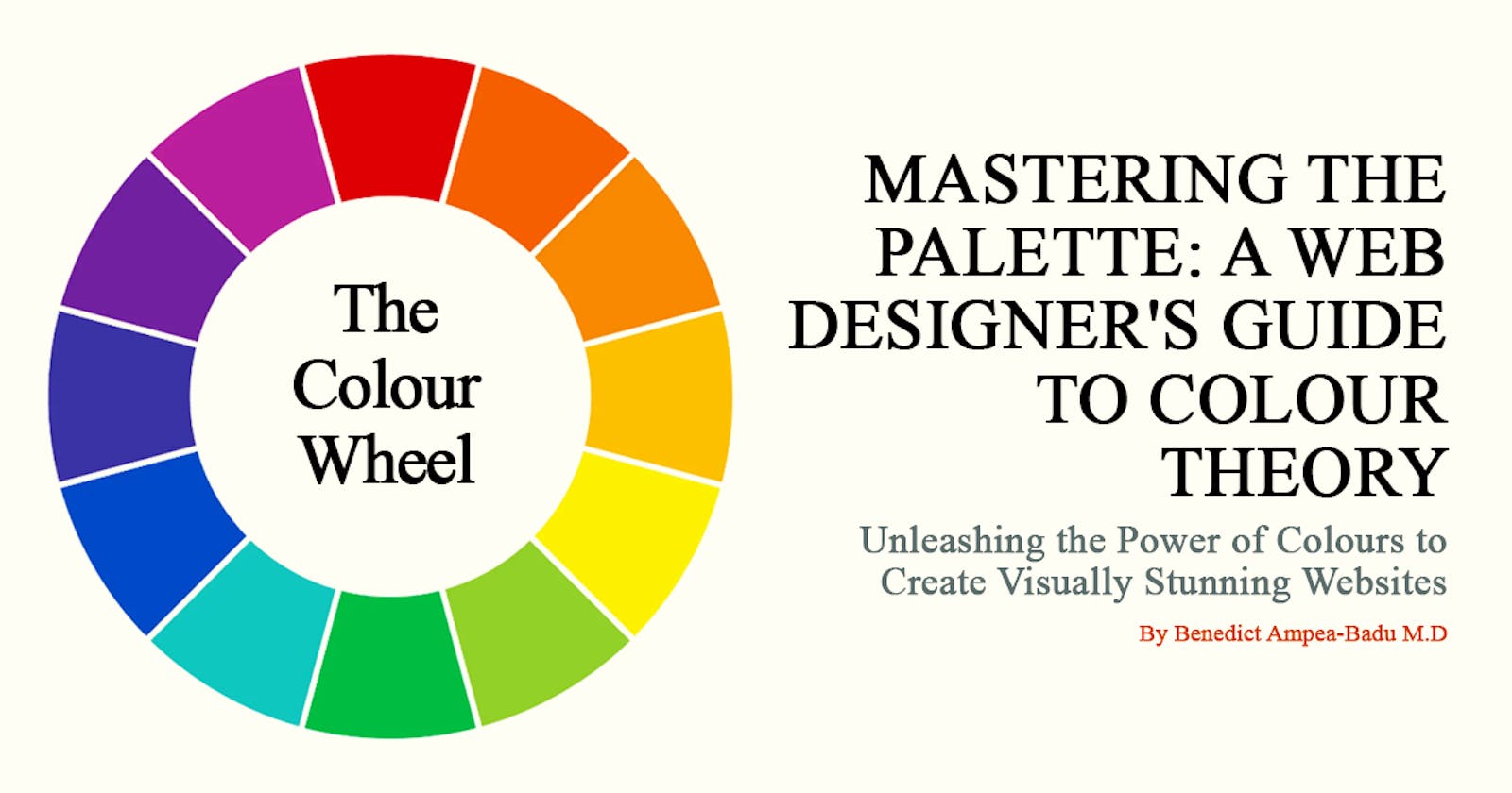
Mastering The Palette: A Web Designer's Guide to Colour Theory
Unleashing the Power of Colours to Create Visually Stunning Websites


Introduction
Hello Fellow Colour Enthusiast, Welcome to the World of Colour!
Buckle up as we embark on an exhilarating adventure into the captivating world of colours. But, before your senses are swept away in a symphony of ecstasy, let's take a quick detour to answer a few intriguing questions as you get ready for an adventure like no other!
What comes to your mind when the traffic light turns red?
How do you feel when your doctor approaches you in his white medical coat?
Why do we use pink to reveal a baby girl in a baby shower?
Why do we paint the room of male children blue?
Why do we wear white during celebratory moments?
To understand what drives the various use of colour in our daily lives, you must take a look at colour theory and what it entails.
A Closer Look at Colour Theory
Colour has been a part of human existence for over 40,000 years. Back then, with a blend of soil, burnt charcoal, chalk, and animal fat, a 5-colour palette was created. The palette was made up of red, brown, black, white, and yellow. The worlds of colours, pigment theory, and colour theories have remained a consistently evolving pilgrimage of discovery, with artistic exploration and scientific advancements at the core (Alexander, 2022).
According to some researchers, the concept of modern colour theory can be traced back to the 14th Century, with its maiden references found in the works of Leone Battista Alberti and some journals of Leonardo da Vinci, which were written in the latter part of the 15th Century (History of Colour Theory, 2021). On the other hand, other researchers believe that colour theory dates back even further, to Aristotle and the members of the peripatetic society, around 384 – 322 BCE (Alexander, 2022). Irrespective of its historical origins, modern colour theory has its foundational basis in the colour wheel, which was invented by Sir Isaac Newton in 1704.
Definition of Colour Theory
Colour theory explores colour interaction, colour combination and how colour influences human perception. It involves understanding the principles and properties of colours and their relationships. This knowledge allows you to create harmonious and aesthetically pleasing compositions across various art forms and designs.
The wide array of knowledge, in relation to colour theory, includes rules and guidelines for diverse colour combinations and their applications. This encompasses the basic terminology of colour theory, colour schemes, colour psychology, human perception, cultural associations, and more.
In summary, colour theory unearths the alluring waltz of colours covering how they interact, blend, and shape human perception. From artistic mastery to scientific exploration, this enigmatic realm unravels the mystery behind harmonious compositions and the emotions colours evoke when our paths cross.
Everyday Hues: The Infinite Intertwining of Our Daily Lives with Colours
Colours play a fundamental and captivating role in our daily lives, saturating various aspects of our everyday routines and interactions. They have a profound impact on our emotions and moods, such as how couples feel when watching the warm and vibrant sunrise, experiencing a burst of positivity as golden morning sunrays stream through their windows.
In our living spaces, the colours we select are more than just aesthetics; they shape our environment's ambiance and influence our perception of the surrounding space. Calming pastel shades cocoon our bedrooms, creating a soothing ambiance that gently rocks us to bed, while energetic and lively hues enliven our living areas, fostering a more social atmosphere.
Beyond their visual appeal, colours are used to communicate essential information. Traffic light colours guide drivers and pedestrians, ensuring safer and more guided decisions on the roads. In the workplace, colour-coded systems organise tasks by priority, boosting productivity and increasing our efficacy. Even in dining experiences, colourful food presentations stimulate appetite, making dishes more appealing.
The significance of colours in our daily lives is immeasurable, as they contribute to our well-being by influencing the way we perceive the world and enhancing how we enjoy life.
Who is the Audience for this Article?
This article is written for 3 sets of people:
People who have a basic understanding of art and design fundamentals
Designers who want to understand the role colours play in user experience
People who are generally looking to understand how to use colours in their everyday life.
Principles of Colour Theory
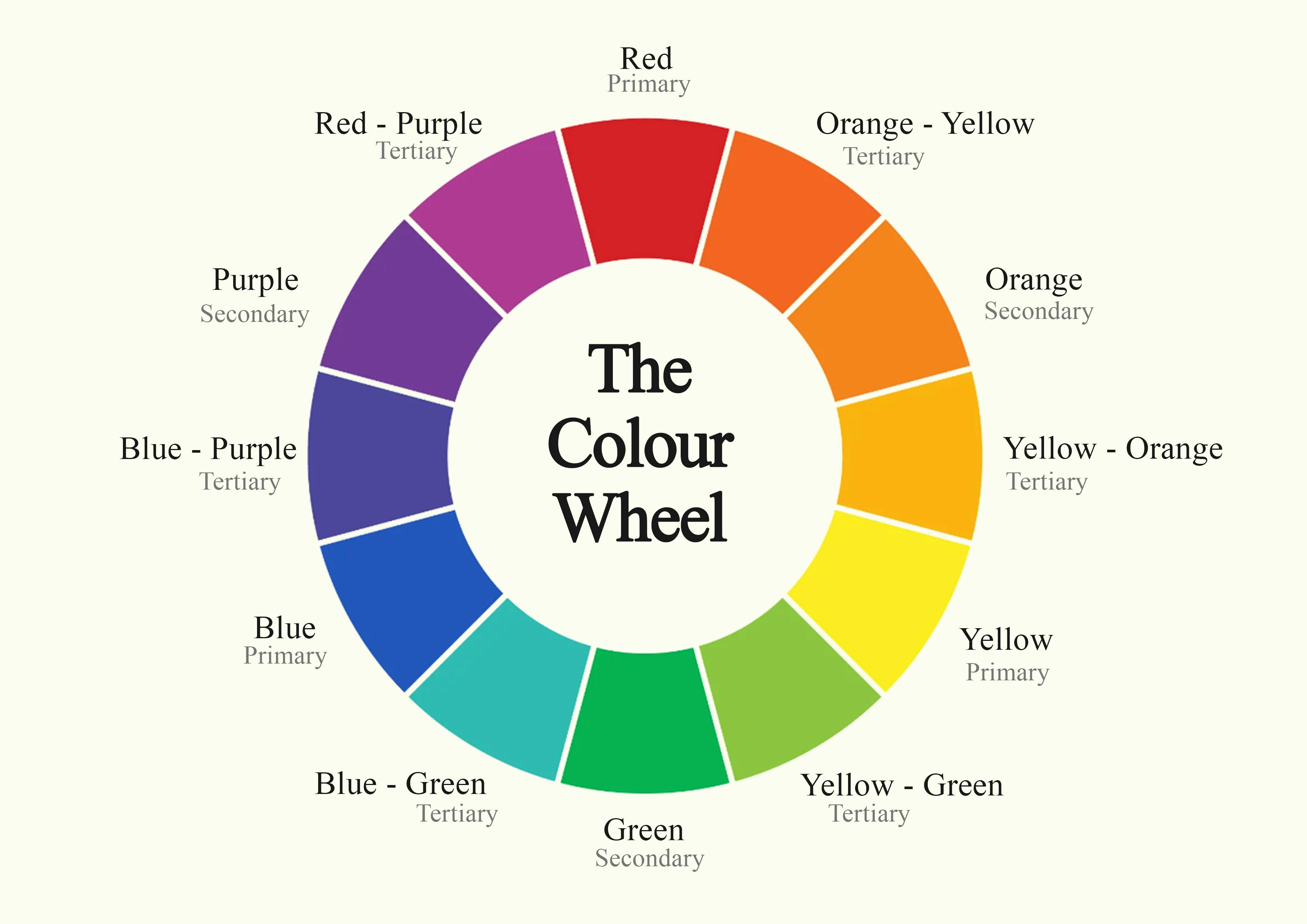
Chromatic Kaleidoscope: The Enigma of the Colour Wheel
The Colour Wheel is the foundation for understanding colour theory and is used in various forms of art and design. It is a visual tool used to represent the relationship between colours. It helps with colour visualisation; thus, helping with the creation of harmonious colour schemes and selection of complementary colours which help craft visually appealing and aesthetically pleasant compositions.
The basic colour wheel is made up of 12 colours, divided into 3 groups:
Primary Colours: These are the foundation for all the colours on the colour wheel. They are traditionally known as Red, Blue, and Yellow. However, in recent times, researchers say an accurate description of these colours will be Magenta, Cyan, and Yellow.
Secondary Colours: A mixture of two primary colours produces these colours. Namely; Orange Green and Purple. These give more variation and expand the colour matching possibilities on the colour wheel.
Tertiary Colours: These colours emerge by mixing a primary colour with an adjacent secondary colour on the colour wheel. These produce unique shades such as red-orange (burnt orange), blue-green (turquoise), yellow-green (lime green), and others.
Vivid Vocabularies: Illuminating the Language of Colour Definitions and Meanings
Before we go any further, there are some definitions associated with colour that we should take a look at. On this journey, we do not intend to leave anyone behind. So, let us get everyone on the same page by clearing up any confusion created so far with the use of these words.
Saturation: Known as the soul of colour. It describes the intensity and depth of colour. By increasing saturation, the colour will become richer and darker, projecting an alluring brilliance. On the contrary, reducing saturation makes colour appear faded and lighter – infusing a muted, subdued and delicate gracefulness to the colour. A colour's saturation is aptly described when we call them "dark blue" or "bright red." These names express to another person, the intensity and depth of the colour, planting a picturesque idea of what it is in their mind.
Hue: Called the essence of colour. Hue defines a colour’s similarity to or distinction from other colours. When assessing the hue of a colour, the comparison is usually done against the colours of the rainbow - red, orange, yellow, green, blue, indigo, and violet. Therefore, when a colour is said to be bluish-green, you immediately get the idea of it having two hues – blue and green.
Lightness: Also referred to as value or tone, helps in the determination of the perceived brightness of a colour in reference to pure white. It represents the degree of illumination and darkness within a colour. Lightness can be used to set the mood and atmosphere. In the sense that, colours with a higher lightness value appear brighter, exuding vibrancy, joy, and optimism. Conversely, colours with a lower lightness value tend to express a deeper, more sombre ambiance, used to express feelings of mystery or intimacy.
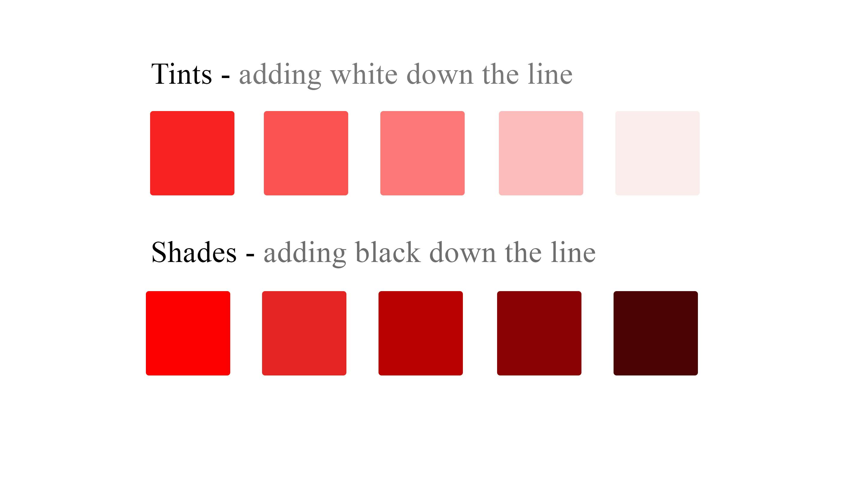
Tints and Shades: To get a tint, you add white to colour. This illuminates the colour, making it appear luminous, softening the vibrancy of the hue and giving it an ethereal glow. Due to this, tints are used to create serene atmospheres and are often associated with innocence and purity. On the other hand, when you want to add mystery to a colour, you add black to the colour, creating a shade. Shades are used to add depth and dramatic flair to colours, as shades cloak colours in velvety darkness. Shades tend to evoke a sense of elegance and sophistication.
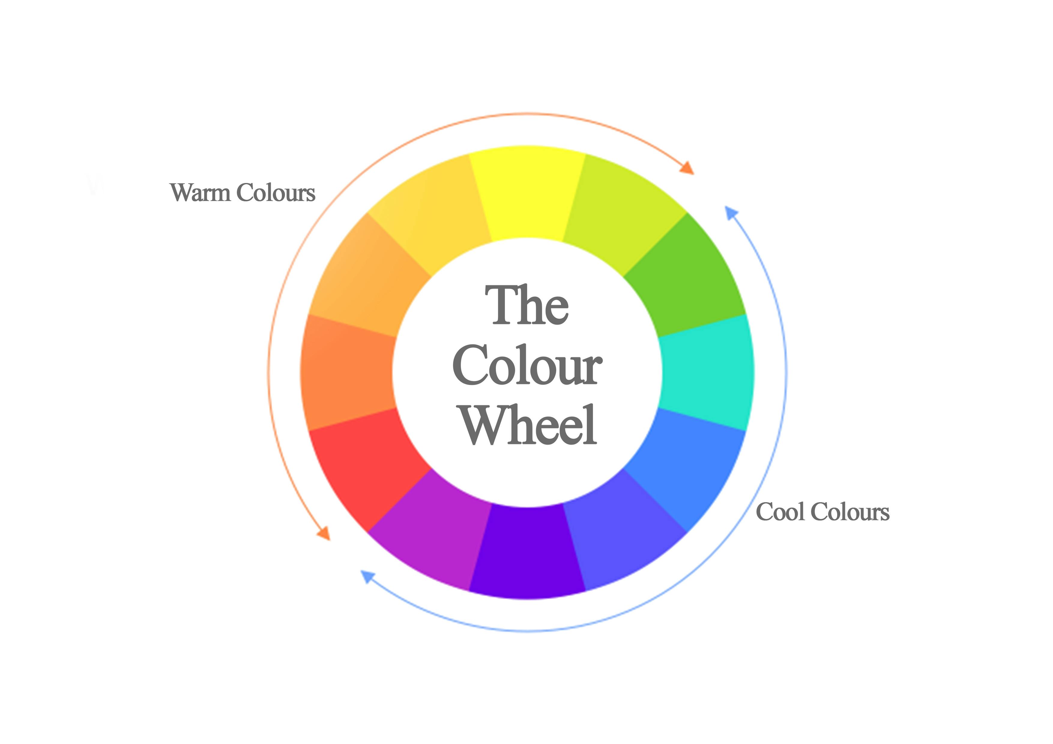
Warm Hearts, Cool Minds: The Magic of Colour Temperature
Concerning colour temperature, colours are grouped into 2 categories;
Warm Colours: These colours usually have elevated levels of yellows and reds. They are usually attention-grabbing as they evoke feelings of passion, happiness, and heat. These colours are also assertive and can trigger a sense of danger. Thus, are often used in alert messages and warning signals.
Cool Colours: On the other hand, cool colours have heightened blue and purple elements. They are generally soothing and are used to express serenity and tranquillity. Thus, are often used for the presentation of chilly landscapes and serene water bodies. However, cool colours can also be used to communicate melancholy.
Chromatic Serenity: The Elegance of Colour Harmony
Understanding Colour Harmony is essential to every art-inclined person. Mastering colour harmony and the elegance it brings to your artistic expression is fundamental to your creative process. By skillfully selecting and combining colours, you can craft an evocative, harmonious, and balanced work of art that will deeply resonate with people. 6 main types of colour harmony are commonly used, these are;
- Monochromatic Colour Scheme: This colour scheme focuses on a single base hue, its varying shades, tints, and tones. This scheme projects an aura of minimalism and consistency in the simplicity of its expression. The scheme relies on the refinement produced by the delicate interconnections within the chosen hue’s lightness and darkness. Monochromatic colour schemes are widely used in design and art for their sophisticated yet soothing aesthetic appeal. They seamlessly blend different intensities of a single colour to produce captivating and aesthetically charming compositions.

- Analogous Colour Scheme: This involves the use of three colours, adjacent to each other on the colour wheel. These colours exhibit harmony due to their tonal similarities. Unlike the monochromatic colour scheme, which relies on a single base hue, the analogous colour scheme displays an intriguing interplay of colours. This allows for variety and depth to be created, without sacrificing harmony. Due to the subtle gradations between the neighbouring colours, which exude an engaging feel of comfort, analogous colour schemes are gradually becoming a popular choice in art and design. The use of this colour scheme can make one’s work appear sophisticated and elegant.
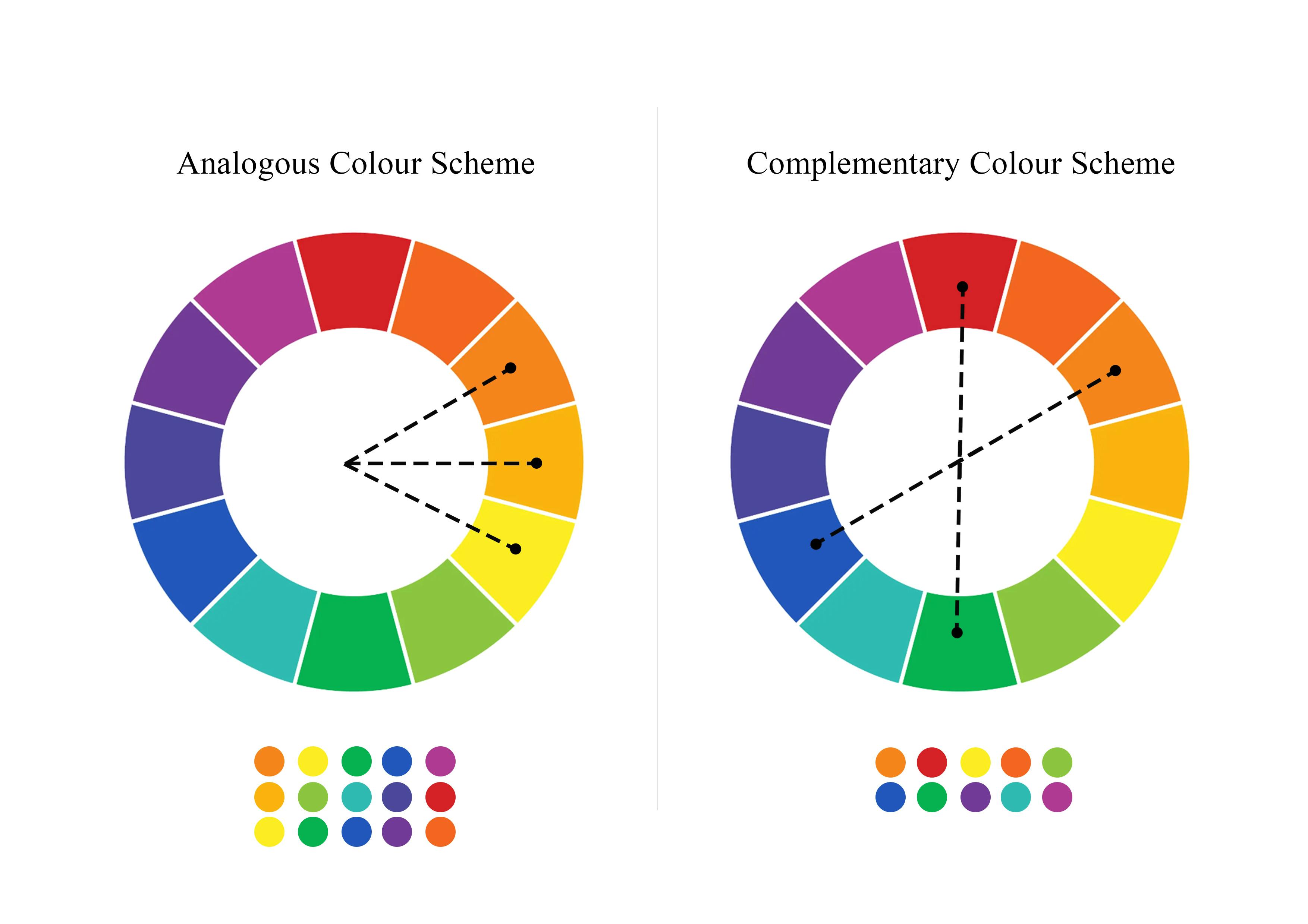
Complementary Colour Scheme: This scheme pairs colours from the opposite ends of the colour wheel. These colours, based on their positions, are in direct contrast with each other. Thus, they amplify each other when placed side by side – accentuating their brilliance. The complementary colour scheme is used in diverse creative expressions, mostly to depict excitement and energy. This is because these colours balance each other's intensity whilst allowing for a dramatic visual impact by drawing attention and creating a sense of visual tension.
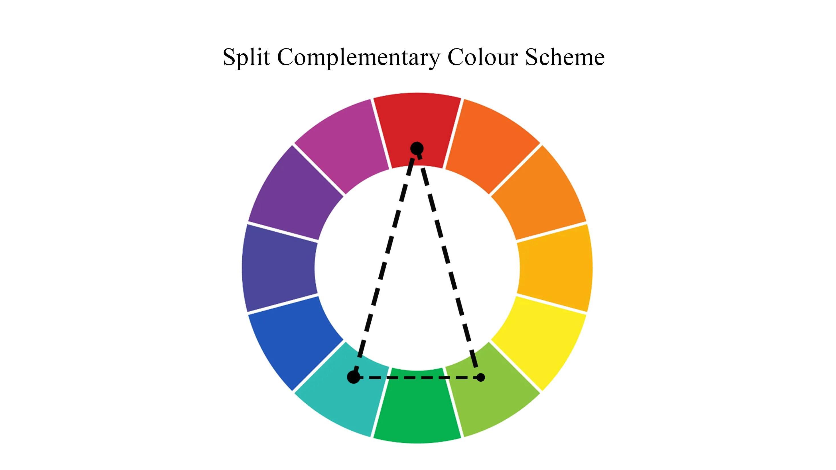
Split Complementary (Compound) Colour Scheme: This scheme is a variation of the complementary scheme, which aims at expanding the range of colours that can be used. In this scheme, instead of using one colour and the colour directly opposite from it, a base colour is chosen and used together with the 2 colours adjacent to its direct opposite. This colour scheme allows for versatility when used.
- Triadic Colour Scheme: This scheme uses 3 colours that are on separate ends of the colour wheel but are equilaterally distant from each other. This colour scheme is used to bring about dynamism, whilst creating more room, for artistic versatility and creativity to be seen.
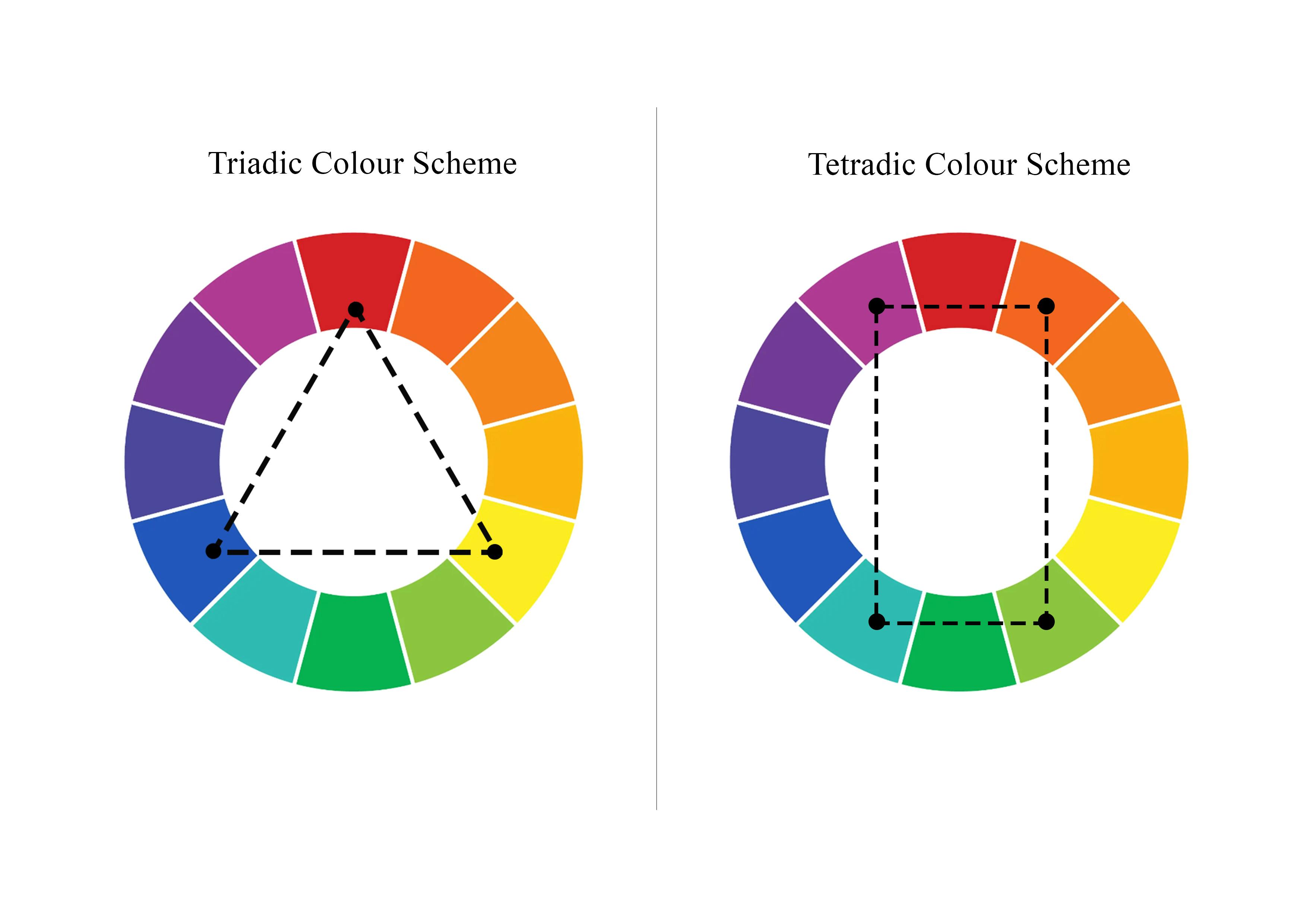
- Tetradic Colour Scheme: To create a tetradic colour scheme, you start with a base colour and then identify its complementary colour. Next, you locate the other two colours that complete the rectangle but are equally distant on the colour wheel. This scheme is also known as the double complementary or rectangular colour scheme with its unique quality being the combination of two complementary pairs.
Colourful Conversations: Expressing Atmosphere through the Palette
As established earlier, colours have the profound ability to set the atmosphere of their perceiver. Colours can alter the mood and emotions of those who come into contact with them. The study of the effect colour has on human perception is termed colour psychology. The effect of colours, although subjective, can also be looked at objectively. The objective viewpoint is that various cultures and societies share common associations with colours. As a designer or creative, understanding colour psychology is beneficial to your work. Well-planned and well–thought colours, can evoke strong emotions in the perceiver, urging them to make certain decisions – such as purchasing products. Thus, easily improving upon sales conversion.
Below are examples of some common colour associations:
| Colour | Association |
| Red | - Symbolizes Passion, Energy, Love, and Danger |
- Symbolizes Luck and Prosperity in some cultures |
| Blue | - Symbolizes Tranquility, Calm, Trust, and Stability
- Lighter blues can be used to symbolize freshness and cleanliness. |
| Yellow | - Symbolizes Happiness, Joy, and Optimism.
- Evokes warm and cheerful feelings |
| Green | - Associated with Nature, Growth, and Renewal.
- Communicates balance and harmony |
| Orange | - Symbolizes Enthusiasm, Creativity, and Excitement |
| Purple | - Associated with Royalty and Luxury
- Symbolizes Creativity, Wisdom, and Spirituality |
| Black | - Symbolizes Power, Elegance, and Mystery
- Some cultures associate it with Sadness and Mourning |
| White | - Symbolizes Purity and Innocence.
- Commonly used in weddings and religious ceremonies in some cultures |
Decoding Colour Context: Revealing the Impact of Colours in Design
Colours, despite their numerous properties, cannot exist and function in isolation. They are influenced by their surroundings and the way they interact with other colours and visual elements. This fascinating phenomenon is known as colour context.
In the world of design, understanding colour context is necessary for creating aesthetically pleasing and meaningful designs. As established earlier, a skilful combination of colours in a design can evoke a spectrum of emotions, set moods, and effectively convey messages.
Moreover, colour context can even alter our perception of size and proportion, allowing designers to create optical illusions. Thus, adding depth and dimension to their creations.

Taking a look at the image above, you'll be tempted to believe that both squares at the centre of the boxes are different in size. However, they are the same size. By surrounding one with an all-black casing, the image tricks our eyes into perceiving the uncased square as smaller. This intriguing example demonstrates the powerful influence of colour context on our visual perception."
Closing Remarks
In conclusion, the idea of crafting captivating, innovative, and impactful designs hinges on how well you comprehend and can apply colour theory. A designer who understands the principles of colour harmony, colour context, and psychology, can strategically select and combine colours to evoke intentional emotions, set the desired mood, and effectively communicate the intended brand message to users.
Colour theory sets the tone for the designer to be able to create appealing, harmonious, and cohesive designs that resonate with users. Thus, enhancing the overall user experience. By leveraging the psychological influence of colours, you can guide user behaviour and build a recognised brand, by establishing a distinct visual identity for your brand.
Moreover, experimenting with various colour schemes, gradients, and shades enables the designer to create unique and innovative designs, reflecting the heart of the designer and leaving a lasting impression on users. Embracing the infinite depths of colour theory is akin to giving yourself a secret advantage, which will give wings to and breathe life into every design you create.
Colour theory is the platform you need to stand out. It is the platform that will let your voice be heard and all your emotions be felt. Take your time to understand it, and when you are done, come share your heart with the World.
References
Alexander (2022, May 30). The History of Color Theory: Must-Know Facts for Creatives - Pigment Pool. Pigment Pool - Iconic Paintings of Modernism. [pigment-pool.com/the-history-of-color-theor...
History of Color Theory. (2021, March 24). Retrieved from [study.com/academy/lesson/history-of-color-t...